



LinkedIn's See More Cutoff: Master the Fold in 2026
The LinkedIn 'See more' cutoff kills engagement before your hook lands. Here's the exact character limits for desktop, mobile, and comments - and how to survive the fold.
 By Anirudha Published
TL;DR
LinkedIn collapses your post behind a “See more” link at approximately 140 characters on mobile and 210 characters on desktop. Since the majority of LinkedIn’s audience is on mobile, the 140-character threshold is where your engagement is won or lost. Emojis bite harder than you think - standard ones count as 2 characters, skin-tone variants up to 7. “Broetry” formatting (one sentence, Enter twice, one sentence) doubles the problem by consuming vertical line height and triggering the fold even earlier than your character count suggests. Short, bold, declarative opening statements outperform questions every time. And guessing where your hook ends is a losing game - PostTruncate’s LinkedIn character counter shows both fold lines live as you write.
The numbers that actually matter
I’m going to give you the exact figures right now, because everything else in this article builds on them.
Desktop fold: ~210 characters, roughly 2-3 short sentences. Everything after that hides behind “…see more.”
Mobile fold: ~140 characters. About a sentence and a half. This is the dangerous one.
Comments: ~150 characters on mobile before the same fold kicks in.
Overall post limit: 3,000 characters - generous, mostly irrelevant. The fold is the real ceiling.
The gap between desktop and mobile - 70 characters - sounds small until you realise that a hook you carefully crafted to land at 190 characters is invisible to every mobile reader. They scroll past without ever tapping “see more,” which means your best line never existed for the majority of your audience.
According to PostTruncate’s LinkedIn character limits research, posts where the main value sits below the mobile fold see 40-60% lower engagement than posts that deliver the core message within the first 140 characters. The LinkedIn algorithm tracks dwell time and early engagement - likes and comments within the first hour - which means the fold isn’t just a display choice. It actively shapes your reach.
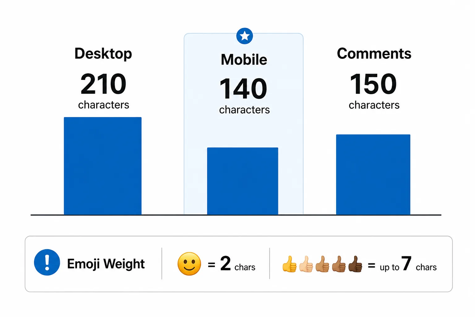
LinkedIn character limits infographic showing desktop fold \~210 chars, mobile fold \~140 chars, comments \~150 chars, with emoji weight warning for skin-tone variants using up to 7 characters, as taken from PostTruncate
Emojis are eating your hook
Here’s the technical detail most creators miss. On LinkedIn, emoji character weight is not uniform.
A standard emoji - 😊, 🔥, 👍 - counts as 2 characters, not 1. Unicode encodes most basic emojis as two code units in UTF-16, and LinkedIn’s character counter follows that convention. So if you’re working within a 140-character mobile window, you’re effectively working with a 70-emoji limit before you’ve typed a single word.
Skin-tone modifiers and ZWJ (Zero Width Joiner) sequences are far worse. A thumbs-up with a specific skin tone: 4 characters. A family emoji built from multiple combined characters: up to 7 characters. These “combined” emojis are invisible complexity - they look like one glyph in your text editor but count like a short word on LinkedIn’s backend.
I ran into this personally. I wrote a post about landing a client I’d been chasing for six months. I was proud of it. Timed the hook perfectly - or so I thought. Then I pasted it into a preview tool and saw that one skin-tone variant on the celebration emoji had pushed my opening sentence to 147 characters. The punchline landed at character 158. Every mobile reader got a cliffhanger with no payoff. Click-through was a fraction of what I expected.
The fix was simple: swap the 7-character skin-tone emoji for the base version (2 characters). Five characters back. Hook restored. The version with the base emoji outperformed the original by a significant margin.
The rule: if your hook is anywhere near 140 characters, treat every emoji as suspicious. Check the actual count, not the visual count.
The whitespace trap: why “broetry” breaks the fold
Every LinkedIn creator has seen the broetry format:
One sentence here.
Enter. Enter.
Another sentence.
Enter. Enter.
A third.
It spread because short-form, single-sentence paragraphs are genuinely easier to read on mobile. A wall of text is still a wall of text, even on a 6-inch screen. Whitespace works as a readability tool.
The problem is that the LinkedIn “See more” cutoff isn’t triggered purely by character count. It’s also triggered by physical vertical height - specifically, the number of rendered lines a post occupies before the fold. LinkedIn typically collapses posts after 3 to 5 visible lines on mobile, depending on the device resolution and font rendering.
A double line break in broetry takes up two lines of height with essentially zero characters. Do that between every sentence and you’ve consumed your entire vertical budget before you’ve said anything interesting.
Here’s what this looks like in practice. A three-sentence intro in flowing prose might occupy 3-4 lines and sit entirely above the mobile fold. The exact same three sentences formatted as broetry - with double line breaks between each - could occupy 7-9 lines, triggering “See more” after just the first sentence.
The hook you buried at sentence three? Invisible to most readers, regardless of character count.
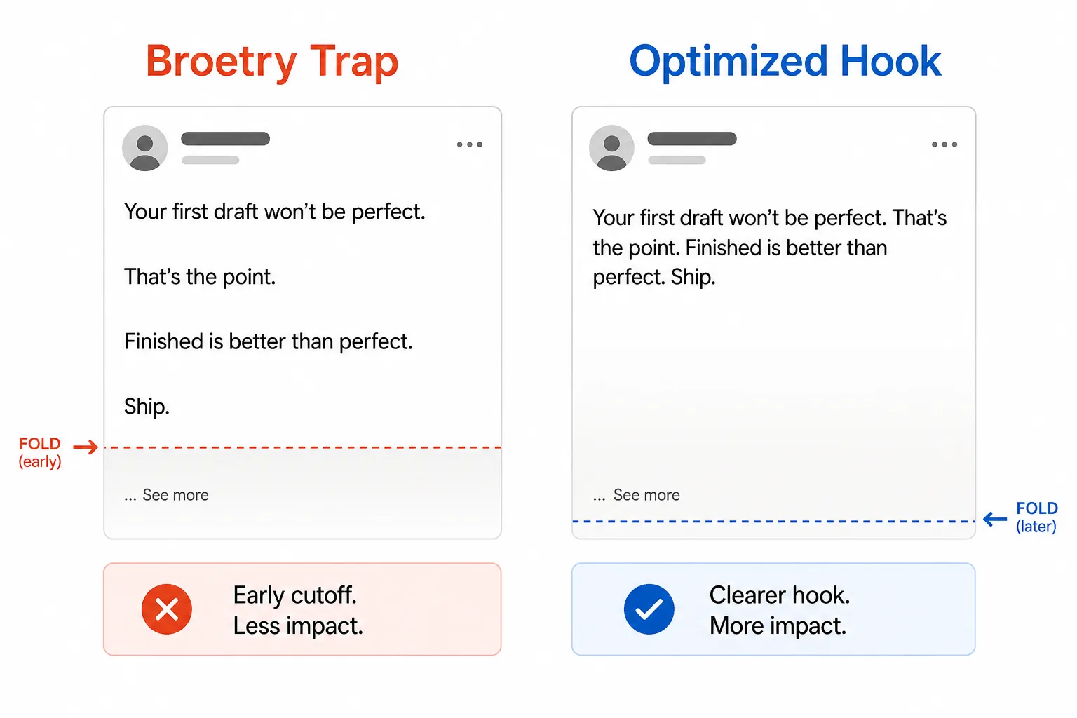
Split-screen comparison showing the Broetry Trap on the left triggering early See more cutoff due to double line breaks, versus an Optimised Hook on the right with compact lines keeping more content above the fold, as taken from PostTruncate
This doesn’t mean abandon whitespace entirely. Single line breaks work fine - they create breathing room without consuming a full visual line. Double line breaks in the first 3-4 sentences are where people get hurt. After the fold, format however you want. Nobody’s abandoning a post they’re already reading because of line breaks.
What actually drives “See more” clicks in 2026
Here’s where the copywriting psychology matters. LinkedIn’s fold is a conversion event. The reader either clicks through or scrolls on, and their decision takes less than a second. Understanding what drives that click is the whole game.
Short bold statements, not questions
Questions were everywhere on LinkedIn three or four years ago. “Have you ever felt like your team just wasn’t aligned?” “What’s the biggest mistake you made in your first year of business?” They felt conversational, and for a while they worked.
They don’t anymore - at least not as a lead. Research on social media hooks consistently shows that short, declarative statements of 5-10 words outperform questions as opening lines. The reason is cognitive: a question puts the mental load on the reader to answer it, and a distracted scroller doesn’t have that bandwidth. A bold statement, by contrast, does the work for them - it presents a specific reality that’s either true or surprising enough to demand explanation.
“I fired my best client last year.” That’s a 5-word statement with a ready-made tension. It raises a question without asking one.
“We cut our onboarding drop-off by 40% by removing one form field.” That’s a number with a claim. The reader either believes it (and wants to know which field) or doesn’t (and wants to know how you’re measuring it). Either way, they click.
Questions work as a follow-up - after the statement has earned attention, posing a question in sentence two invites the reader into a dialogue they’re already engaged in. Lead with a statement, follow with a question. Not the other way around.
The open loop
The most reliable hook technique in 2026 is the open loop: starting a story or insight mid-scene, creating an information gap that can only be closed by reading past the fold.
The key is specificity. Generic open loops (“Something happened that changed how I think about sales forever”) create no actual tension. Specific ones do.
“I said no to a $20,000 project last month. It was the best decision I’ve made.”
That’s two sentences, 79 characters, well within both the mobile and desktop fold. The tension is immediate and specific: why would turning down $20,000 be a good decision? The reader needs to know. That’s what “See more” clicks look like.
The open loop works because of a well-documented psychological principle: incomplete patterns generate cognitive discomfort that the brain wants to resolve. The technical term is the Zeigarnik effect - we remember and fixate on unfinished tasks more than completed ones. Start a story in a way that feels genuinely incomplete, and your reader’s brain will not let them scroll past it.
The failure mode is telegraphing the resolution before the click. “I said no to a $20,000 project and here’s why it was actually smart” closes the loop in the hook itself. The reader already has the answer. No click needed.
The credibility spike
A third option that works especially well for founders and operators: lead with a number that establishes instant credibility.
“After 50 LinkedIn posts and $0 on ads, here’s what we know about reach.”
“We ran 200 A/B tests on LinkedIn hooks this year. One pattern won every time.”
The number is the hook. It says: this is not opinion, this is data. The specificity signals real experience in a way no amount of adjectives can. LinkedIn creators, ghostwriters, and B2B founders reading this post: the number hook is probably underused in your content calendar. Try it.
Mobile is where your reach actually lives
There’s a tendency to write LinkedIn posts at a laptop, preview them at a laptop, and think in terms of desktop layout. That’s exactly backwards.
LinkedIn’s own data shows that over 60% of active users on the platform are on mobile. For most B2B audiences - where professionals are checking the feed between meetings, on commutes, during brief windows in the day - that number is likely even higher. Your post will be read on a phone more often than not.
This shapes everything. On mobile, your post is narrower, your font renders slightly larger relative to the screen, and your 140-character window is the entire first screen impression. There is no “below the fold” browsing behaviour on mobile the way there is on a long-form desktop page. The fold is a binary - click or don’t. Your hook needs to land within that constraint.
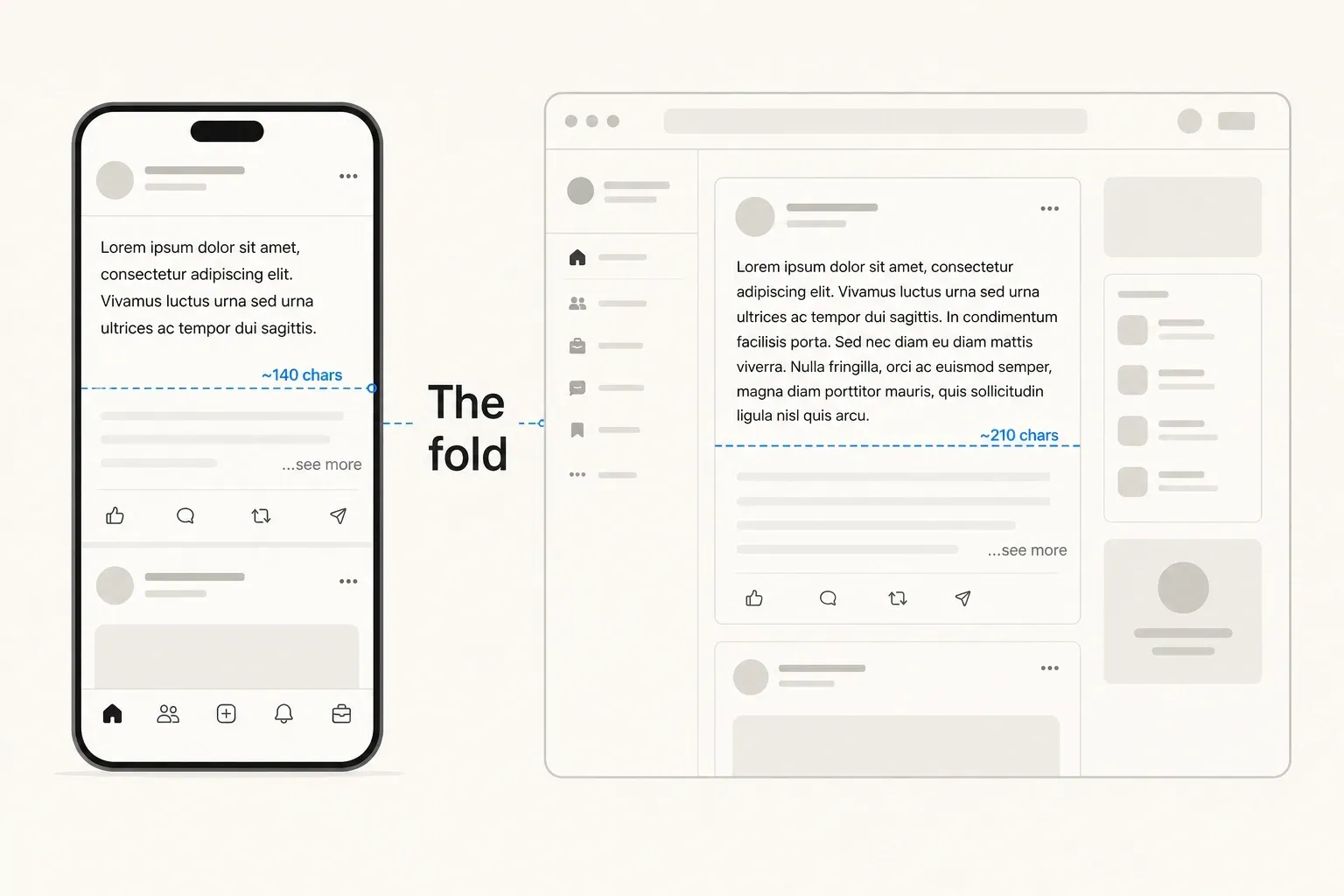
Side-by-side comparison of LinkedIn's mobile fold \~140 characters versus desktop fold \~210 characters showing where posts get cut on each device, as taken from PostTruncate
This is also why formatting choices that look elegant on desktop can destroy a post on mobile. A bold header followed by a bullet list looks clean in a 1200px browser window. On a phone, that header eats the entire first visible line, the bullet points start immediately, and your hook never had a chance to do its job.
Write for the smallest screen first. Everything that works on mobile will work on desktop. The reverse is not true.
The five-word rule for LinkedIn openings
I’ve been writing LinkedIn posts for years and coaching other creators on their copy, and I’ve developed a personal heuristic that’s held up: the first five words of your post have to carry the entire post.
Not the first sentence. The first five words.
If someone reads “We cut our onboarding”, and their brain isn’t already filling in “by how much?” - your hook isn’t there yet. If they read “I was fired from” and they’re not already wondering “from what?” - you haven’t started mid-scene enough.
The test: cover everything after word five. Does what remains create genuine curiosity, or does it create nothing? If nothing, rewrite the opening.
This is especially important for the LinkedIn “See more” fold character limit because the fold hits so fast. On mobile, you have roughly three sentences before the wall. The first sentence has to earn the second, the second has to earn the third, and the third has to earn the click. That chain starts at word one.
The LinkedIn feed in 2026 is brutally competitive. The average user scrolls through hundreds of posts per session, making subconscious triage decisions in under a second. Eye-tracking research on social media feeds shows that most posts get a single fixation point - usually the first two to three words - before the reader decides to keep scrolling or stop.
The emotional triggers that reliably stop a scroll are:
Surprise - information that contradicts what the reader assumed. “LinkedIn posts with no images consistently outperform image posts in B2B reach.” The reader expected the opposite. They need to know why.
Recognition - something that mirrors a specific pain the reader has felt. “I spent 45 minutes writing a LinkedIn post and got 11 impressions.” Every creator who has been there nods. They click.
High stakes - a decision with real consequences. “$20,000 project.” “Series A funding.” “Lost the client.” The number or the outcome signals that this is not a theoretical post. Real things happened. The reader wants to know what they were.
Specific social proof - not “many companies” but “73 companies” or “after my 12th post.” Specificity is the signal that you actually did the thing.
All four of these can land within 140 characters. All four require you to know exactly where 140 characters ends in your draft. Which brings us to the tool question.
Stop guessing where your hook dies
This is the part where I’m going to be blunt: guessing where the LinkedIn “See more” fold lands is a waste of time and a real risk to your engagement.
The fold isn’t a fixed character count - it’s a combination of characters, line height, font rendering, and device resolution. Different phones show slightly different fold lines. The 140-character figure is an approximation, not a guarantee. Your double line breaks, your emoji choices, your sentence length all interact in ways that are genuinely hard to predict by feel.
I built PostTruncate’s LinkedIn character counter because I got burned enough times. The tool renders your post in a real LinkedIn-style preview and shows both fold lines - mobile at ~140 and desktop at ~210 - as visible markers that update live as you type. Toggle between Desktop and Mobile view and you’ll see exactly which words your readers never see without clicking.
It’s free, no sign-up, and your text never leaves your browser. Paste your draft, watch the fold, adjust until your hook is above both lines, and publish knowing that what you wrote is what your audience reads.
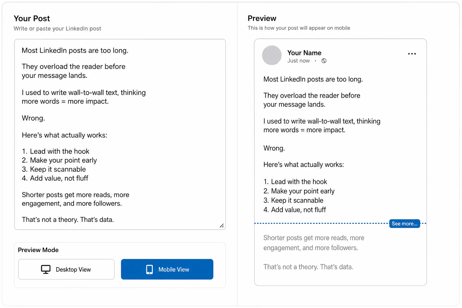
PostTruncate text editor interface showing Desktop View and Mobile View toggle buttons with a visible fold line indicating exactly where See more appears in the live preview, as taken from PostTruncate
The tactical checklist before every post:
- Write your hook - strong, specific, declarative or open-loop
- Check emoji weight - if you’re near 140 characters, audit every emoji for character count
- Cut double line breaks from the first 3 sentences - single breaks only until you’re past the fold
- Preview in mobile view - is the full hook above the fold line?
- Preview in desktop view - does the next sentence reinforce or reward the click?
- Publish
That’s it. No guessing required.
Try PostTruncate
PostTruncate is a free LinkedIn character counter and post preview tool I built for exactly this problem. It shows your post in a real-time LinkedIn-style preview - mobile fold at ~140 characters, desktop fold at ~210 - with both fold lines updating live as you type.
You can toggle between Mobile and Desktop views, spot where emojis are inflating your character count, and check that your hook lands above the fold before you publish. No sign-up, no storage, no data leaves your browser. If you’re writing LinkedIn posts and you’re not previewing the fold before you publish, you’re leaving engagement on the table every single time.
FAQs
What is LinkedIn's 'See more' character limit on mobile in 2026?
On mobile, LinkedIn collapses your post after approximately 140 characters and shows a 'See more' link. Since over 60% of LinkedIn's active audience browses on mobile, this is the threshold that matters most for engagement. You can check exactly where your hook gets cut using PostTruncate's free LinkedIn character counter, which shows the mobile fold live as you type.
Does the LinkedIn fold count line breaks as part of the character limit?
Not directly - but line breaks affect something more important: vertical line height. LinkedIn also triggers the 'See more' cutoff based on the physical number of lines a post occupies, typically after 3 to 5 lines. A double line break (the 'broetry' format) consumes two lines of vertical space with just a newline character, so your fold can appear far earlier than your raw character count suggests. Writing compact, unbroken opening lines is the safest approach.
How many characters does a skin-tone emoji count as on LinkedIn?
A standard emoji (like 😀) counts as 2 characters on LinkedIn. A skin-tone modifier or combined emoji - such as a hand gesture with a specific skin tone, or a family emoji made up of multiple ZWJ sequences - can count anywhere from 4 to 7 characters. If your hook is right at the 140-character mobile limit, a single skin-tone emoji could be enough to push your best sentence below the fold.
Why does 'broetry' formatting trigger the See more link earlier?
Broetry - the practice of writing one sentence, pressing Enter twice, and writing the next - uses double line breaks between every sentence. LinkedIn renders each blank line as a separate visual row, so a broetry post with five sentences and four double breaks can occupy 13 lines of vertical space. LinkedIn typically folds posts after 3 to 5 visible lines, meaning the cutoff hits after just the first two sentences regardless of character count. The fold is partly a character limit, partly a height limit.
How can I see exactly where my LinkedIn post gets cut off before publishing?
Paste your draft into PostTruncate's LinkedIn character counter - a free, no-sign-up tool that renders your post in a live LinkedIn-style preview and shows both the mobile fold (140 chars) and the desktop fold (210 chars) as visible markers that update in real time as you type. Toggle between Desktop and Mobile views to see exactly which words your audience never reads without tapping 'See more.'
Join the discussion
Comments are reviewed before they appear, so yours won’t show up right away.