



TikTok Photo Mode: Preview Text Formatting Before You Post
TikTok Photo Mode drops white caption text directly on your images - no safe zone. Here's how to check your layout before you publish.
 By Anirudha Published

TL;DR
TikTok Photo Mode (carousel) overlays your caption text directly on top of your still images using white text on a semi-transparent dark background. Unlike video posts, there is no automatic gradient safe zone protecting your caption from your photo. If your first slide has a light, pastel, or overexposed background, that white text disappears completely. The fix: preview your caption against your actual image before you post. The fold still kicks in at ~100 characters or your first line break - your hook has about one line to prove itself. Use a TikTok layout checker to simulate the real overlay before anything goes live.
I learned this the hard way
I built PostTruncate.com because I kept getting burned by platforms that looked fine in my phone gallery and fell apart the moment they were published.
The TikTok Photo Mode incident was the one that actually made me stop and think about why I had no tool for this. I had been building character counters and fold simulators for months. I knew exactly where LinkedIn hides text, where Instagram folds captions, what X does to a link’s character count. But carousel photos were a blind spot I had not thought through properly.
One afternoon, I spent a solid 20 minutes curating what felt like a genuinely nice photo dump. Morning light, consistent tones, the kind of pastel grid aesthetic that accounts with 200k followers make look effortless. I wrote a caption that I thought was sharp. Something about the colour palette being intentional, then a question to drive replies. I posted it directly from the app and immediately opened TikTok to see how it looked in the feed.
The caption was invisible. Completely gone. Not truncated behind a “more” button - just visually absent. White text on a light cream-colored morning photo, with about the same contrast as writing in butter on white bread. The hook I had crafted was there in the data, technically, but nobody scrolling the For You Page would ever read it.
That moment is why I built the TikTok layout preview into PostTruncate. Not as a checkbox feature, but as something I needed to exist before I posted another carousel.
I have since heard almost the exact same story from social media managers, lifestyle creators, and food photographers - anyone who works primarily with still images and then runs into TikTok Photo Mode’s peculiar approach to text display. It is a more common problem than TikTok’s UI would have you believe.
What TikTok Photo Mode actually does to your caption
When you post a standard TikTok video, the caption lives in a zone that the platform more or less controls. There is a dark gradient at the bottom of the video frame - a semi-transparent band that darkens the lower portion of the video so white caption text always has some contrast to sit against. Creators still need to keep important content out of the bottom ~20% of the frame (where that UI band lives), but the text itself tends to remain readable because TikTok designed the space for it.
Photo Mode is different in a way that catches creators off guard.
In Photo Mode, TikTok overlays your caption on the bottom of your still image. There is a semi-transparent dark background behind the text - a thin gradient bar that is supposed to do what the video gradient does. And it works fine as long as your image has midtones or dark colours in the lower third. What it does not do is adapt to a bright, light, or overexposed image. The gradient is fixed. The overlay has a certain opacity. If your photo is mostly white at the bottom - a marble countertop, a white wall, a blown-out morning sky, a flat lay on white paper - that dark band does not get darker. It stays at the same translucency, and the white text on top of it disappears into the background.
This is not a bug you can report. It is just how the interface works. The platform renders the caption overlay the same way regardless of what is beneath it. The burden of making text readable against your image is entirely on you, the creator.
Unlike video, where motion draws the eye and the content itself competes for attention, a carousel is a static composition. Every element of the visual design is frozen in place. Viewers who swipe into a carousel are not watching something happen - they are looking at a deliberate arrangement. Bad text contrast does not just degrade the reading experience; it clashes with the aesthetic in a way that registers immediately. It makes the post look unfinished.
There is also a structural difference in how TikTok positions the caption. On video posts, the caption block sits below a certain amount of content. On Photo Mode posts, the caption is positioned so it genuinely overlays the visible image. The first thing many viewers see when they land on a carousel slide is the bottom third of that image, partially covered by the caption bar and the engagement buttons on the right. What is in that region of your image matters more than you might expect.
The safe zone geometry you need to know
Working in Photo Mode means working with a 1080 x 1920 pixel canvas - the standard 9:16 vertical format that TikTok, Reels, and Shorts all share. Within that canvas, TikTok’s native UI covers three distinct regions.
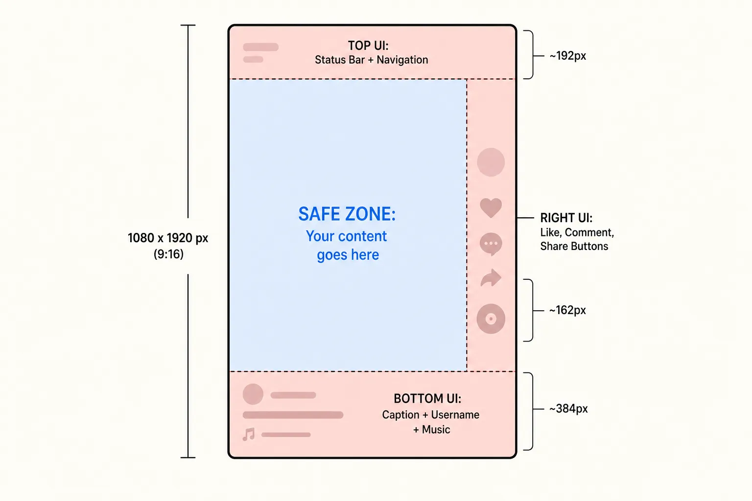
TikTok Photo Mode safe zone diagram showing the three UI overlay regions on a 1080x1920 pixel canvas, with the centre safe zone highlighted
The top ~10% - approximately 192 pixels - is where the status bar and the For You / Following navigation tabs live. Put anything important there, and it competes with the tab bar. For most still photography, this is not a problem, since interesting visual content tends to sit in the centre of a frame, but text elements, logos, or lower-thirds graphics placed at the very top of the image will partially disappear behind the tab UI.
The right ~15% - approximately 162 pixels from the right edge - is the engagement icon stack. Like, comment, bookmark, share, and the creator’s profile photo all stack down the right rail of the screen. This strip is consistently populated with UI elements that are wider and more intrusive than many creators realise when shooting or editing. Any text or graphic element you place in that right-side column of your image will compete visually with those buttons, or worse, be partially covered by them.
The bottom ~18 to 20% - roughly 345 to 384 pixels - is where the most important collision happens. This is where the caption text appears, along with the username, any call-to-action elements, and the music ticker. When you are thinking about TikTok photo mode text formatting and preview, this is the region doing all the damage if your image is light-toned.
That leaves an effective safe zone of roughly 918 pixels wide (85% of 1080) and the upper 70% of the image height for visual content that you want completely unobstructed. In practice, subject matter - faces, products, compositions - naturally gravitates toward the centre of the frame, so most well-composed images already have important content in the safe zone. The caption conflict is more of a text-readability problem than a compositional one.
Why unreadable text kills carousel engagement harder than you think
Carousels are not passive content. When a viewer encounters a photo carousel in the For You feed, they have to make an active choice: swipe through or keep scrolling. That decision usually happens within the first one to two seconds of looking at slide one.
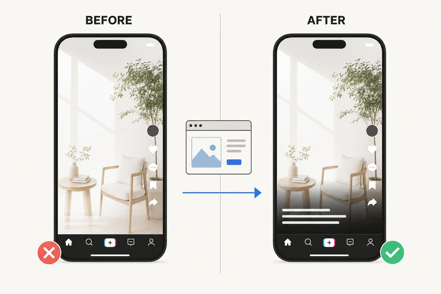
Side-by-side comparison of a TikTok Photo Mode carousel: left shows invisible white caption text against a light background, right shows clearly readable caption after previewing with a layout tool
In a video, the motion itself buys you attention. The opening frames of a video have visual energy even before a viewer reads a caption. On a still image, the photo carries all of that initial weight, and the caption is the second signal - it tells the viewer what to make of the image and whether there is a reason to swipe to slide two.
If that caption is invisible, you lose the second signal entirely. The photo has to work on pure aesthetic appeal alone, with no textual context. Some creators can pull that off. But most creators using Photo Mode are using the caption to do real work: setting up a series, providing context for a photo dump, posing a question, dropping a hook that makes swiping through feel worthwhile. When that text disappears, so does the reason to engage.
The math on this plays out in how creators describe their carousel performance when they fix text contrast issues. Carousels with readable hooks on slide one consistently drive more swipes to subsequent slides and more comment replies than identical carousels where slide one is text-contrast-broken. It is not a subtle effect. The caption is genuinely load-bearing for carousel engagement in a way that it is not for video.
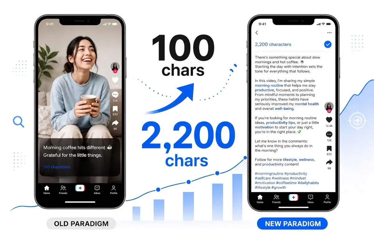
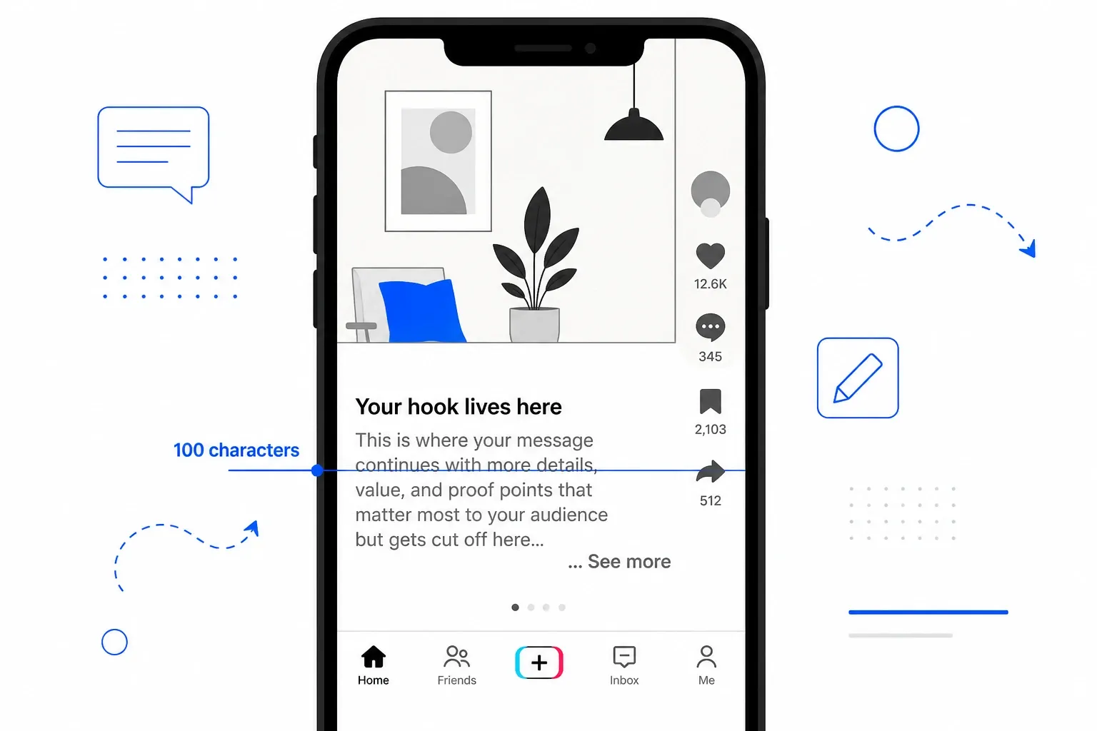
There is also a secondary effect that is easy to overlook: the “more” fold. TikTok truncates captions at approximately 100 characters, or at the first line break, whichever comes first. Viewers who can barely make out the first few words of a fading caption are not going to tap “more” to see the rest. The engagement signal the algorithm uses to rank a post - watch time, swipes through all slides, comments, shares - depends on getting viewers into the carousel in the first place. A broken first impression is not recoverable within the same session.
Understanding TikTok photo mode layout before you publish is not optional if you care about performance. It is part of the creative process.
How to check your carousel layout before you post
The only reliable way to know whether your caption will be readable is to see it on your actual image before anything goes live. This is exactly the problem I built a solution for.
PostTruncate’s TikTok caption preview tool lets you upload a 9:16 image or video thumbnail, type your caption into the editor, and see a real-time simulation of how TikTok will render the text overlay. The character counter tracks where you are relative to the ~100-character fold, and the safe-zone overlay shows you which regions of your image are covered by the UI.
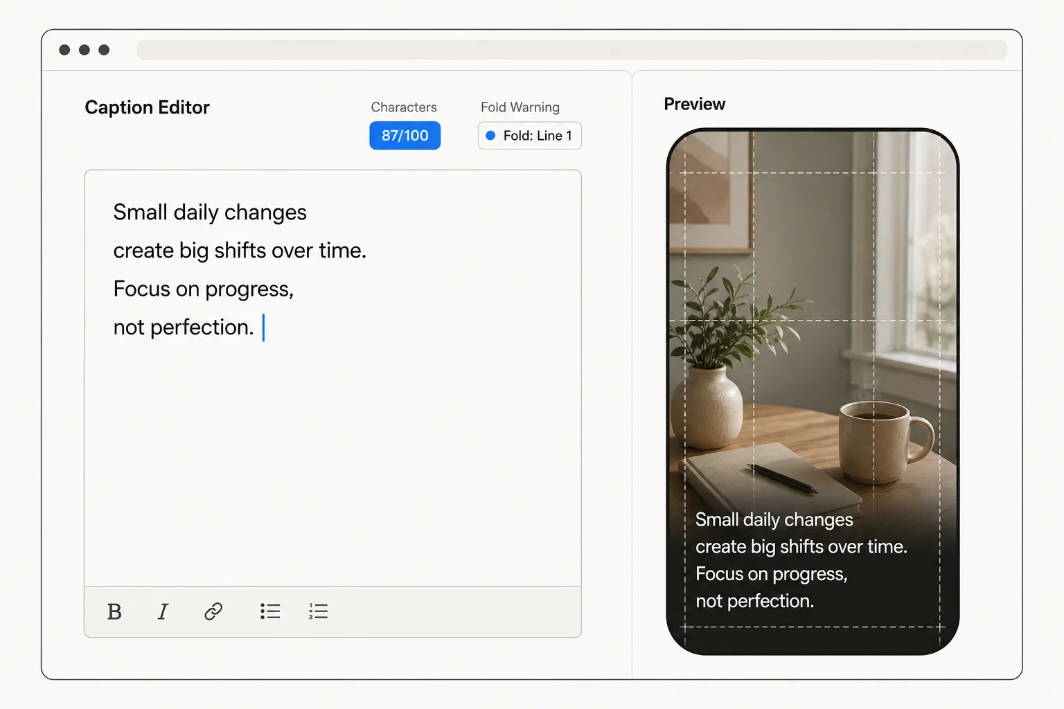
Interface of the PostTruncate TikTok caption preview tool showing a split-panel view with a text editor on the left and a live phone-screen preview on the right, simulating how captions appear over a carousel image
The practical workflow looks like this: you finish editing your carousel in whatever photo editing app you use, export the first slide at full resolution, then drop it into the preview. You type your caption and immediately see whether the text sits on a dark enough area of the image to stay readable. If the overlay is fighting the background, you know to either revise the photo (add a gradient to the bottom third, darken that region, or switch to a different slide for the lead image) or adjust your caption format.
Because the fold kicks in at the first line break, the preview also shows you exactly how much of your caption a viewer sees before the “more” button appears. A caption that looks complete in your notes app might fold before your hook finishes its sentence.
For social media managers handling multiple client accounts, this preview step is especially useful before handing off to a content calendar. You can check that slide one works visually without needing to publish a test post, wait for feedback, delete it, revise, and repost.
The formatting workflow I now follow for every carousel
I have tested enough carousel posts to have a fairly consistent pre-post checklist. It is not complicated, but skipping any step in it is how I used to end up with the invisible-caption problem.
Photo selection and editing first. When I am building a carousel, I deliberately look at the lower third of every candidate for slide one. If the image is bright or light in that region, I either swap it for a different lead image or I add a subtle gradient in editing - darkening from the centre down to the bottom edge. Not enough to change the photo’s aesthetic, just enough to give the caption bar something to contrast against.
Write the caption with the fold in mind. I draft in PostTruncate’s editor so I can see the live character count. The goal is a hook that lands in the first 90 characters, leaves no line break before that, and makes someone want to swipe. Everything else - context, hashtags, credit lines, location - goes below the fold. Hashtags, especially: a wall of hashtags above your hook burns through your visible character budget and pushes the actual message below the “more” button before most people see it.
Run the preview against slide one. Once I have the photo and the caption, I drop both into the TikTok layout preview and check three things: is the text readable, does the hook clear the safe zone, and does the visible portion of the caption end in a way that makes tapping “more” feel worthwhile or at least not punishing?
Check the right rail too. If I have any text elements baked into the image itself - a price, a date, a location name - I make sure they are not sitting in that right-side 162-pixel column where the engagement buttons will partially cover them.
Post and monitor the first 30 minutes. Carousel completion rate (the share of viewers who swipe through all slides) and comment volume are the signals I watch most closely right after posting. Both are sensitive to whether slide one’s caption is doing its job. If completion is low, it almost always traces back to something on that first frame.
This is a five-minute check that has saved me from discovering formatting problems after the fact. The post-publish fix - deleting, editing, re-uploading, hoping the algorithm does not penalise you for the deletion - is not a real fix. The algorithm already saw the early drop-off.
Try PostTruncate
I built PostTruncate because I needed it - and once I had it, I could not imagine going back to posting carousels without checking the layout first. The TikTok caption preview runs entirely in your browser. Nothing is uploaded to a server. You paste your image, type your caption, see exactly what your audience will see, and then decide whether it is ready to post.
For TikTok creators, social media managers, and aesthetic influencers who care about how their work actually looks in the feed, the preview step takes less time than writing the caption itself. The tool also catches the character fold issue, the safe zone conflicts, and any line break that would trigger early truncation - all in one pass, before anything goes live.
If you have ever posted a carousel and noticed the engagement fall flat despite photos you felt good about, there is a reasonable chance the caption was the problem. Take 60 seconds to check it before the next one goes out.
FAQs
What is TikTok Photo Mode and how is it different from regular video posts?
TikTok Photo Mode (also called carousel mode) lets you post up to 35 still images that viewers swipe through, rather than a looping video. The key UI difference: instead of the caption sitting in a gradient-backed safe zone at the bottom like in videos, the caption text overlays directly on your still image with a semi-transparent dark background. Because the image is static, any colour clash between your photo and the caption text is immediately obvious - there is no motion to distract from it.
How do I fix unreadable caption text on TikTok Photo Mode carousels?
The most reliable fix is to preview your caption against your actual image before posting. Use PostTruncate's TikTok caption preview tool to upload your image and simulate exactly how the UI overlay will look. For the photos themselves, choosing images with darker lower thirds (or editing a subtle gradient into them) gives the white TikTok caption text enough contrast to read cleanly.
What are the TikTok Photo Mode layout safe zones for 1080x1920 images?
On a standard 1080x1920 pixel canvas, three areas are covered by TikTok's native UI: the top \~10% (status bar and navigation tabs, roughly 192 pixels), the right \~15% (engagement buttons, roughly 162 pixels wide), and the bottom \~18-20% (caption text, username, and music ticker, roughly 345-384 pixels). Your effective safe zone for important visual content is the centre region, covering roughly 918 pixels wide and the upper 70% of the image height.
Does TikTok Photo Mode caption text cut off the same way as video captions?
Yes. Photo Mode uses the same caption truncation behaviour as standard video posts. The '...more' fold kicks in after roughly 100 characters or at the first line break, whichever comes first. Your hook must fit in the first 100 characters of your caption with no early line breaks. Hashtags, credits, and extended copy go below the fold, where only viewers who tap 'more' will see them.
Why do my TikTok carousel posts have low engagement even with good photos?
Low engagement on carousels often traces back to the caption - specifically an unreadable hook. When white TikTok caption text lands over a light-toned image on slide one, most viewers cannot read your opening line. Since the caption is the primary driver of swipes and comments on a static photo post (unlike video, where motion hooks attention), an invisible hook means most users scroll past without engaging at all. Checking your text contrast before posting is one of the highest-leverage fixes available.
Join the discussion
Comments are reviewed before they appear, so yours won’t show up right away.