



TikTok ad layout: why in-feed ads break your organic formatting
TikTok's in-feed ad CTA button injects into your organic layout and covers on-screen text. Here's the exact layout shift media buyers need to know.
 By Anirudha Published
TL;DR
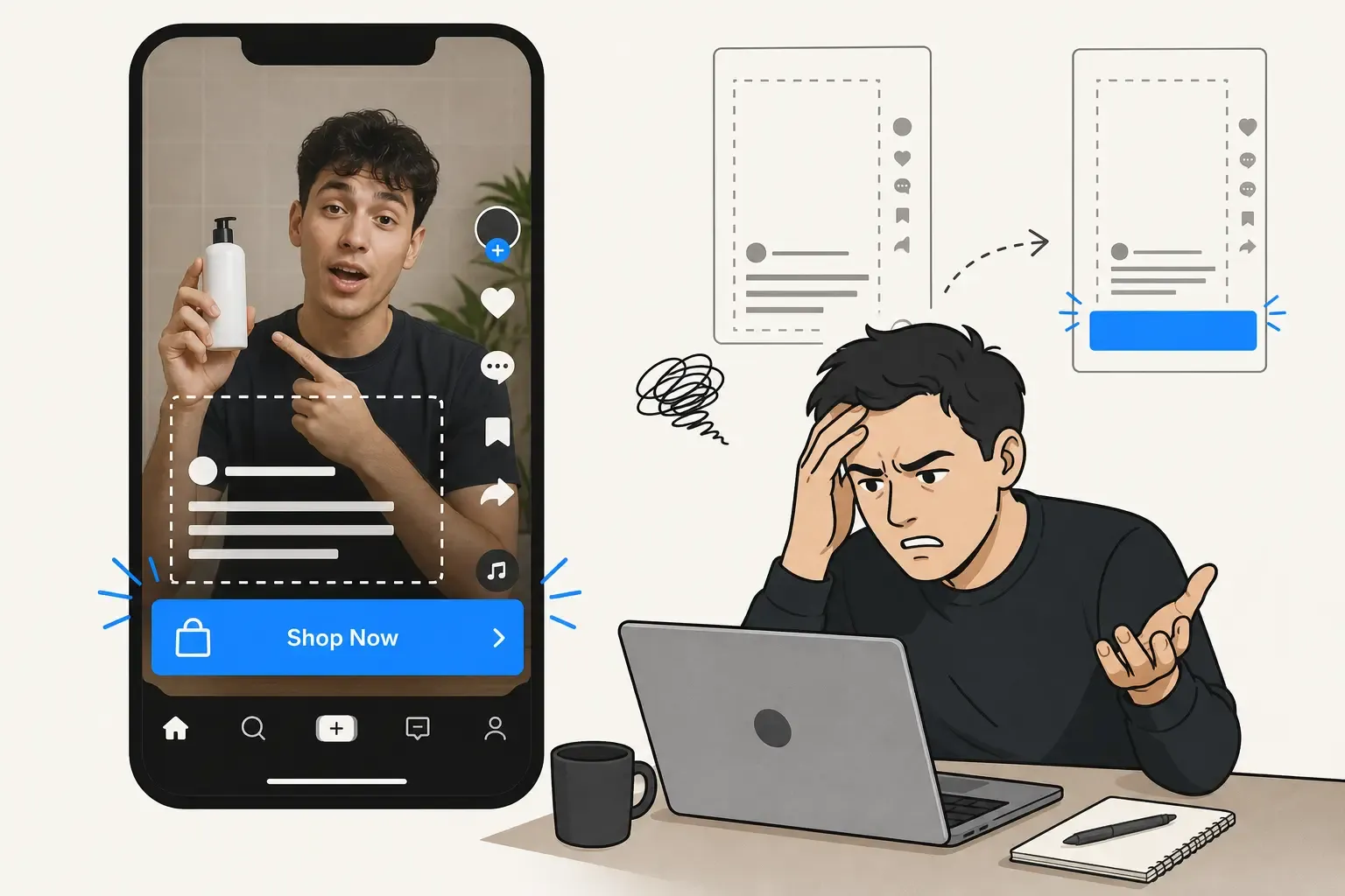
TikTok in-feed ads inject a large CTA button (Shop Now, Download, Learn More) directly above the username - an element that does not exist in organic posts. This shifts the entire bottom UI stack upward by roughly 120–150px on a 1080x1920 frame, turning the organic bottom unsafe zone from ~20% of the screen to ~25–30%. Any on-screen subtitle, price overlay, or logo you placed in that band - correctly positioned for organic - gets partially or fully covered when your video runs as an ad. The fix is to check your creative in both Organic View and Ad View before you spend a single dollar. PostTruncate’s TikTok ad preview tool has a toggle that simulates this exact CTA injection so you can adjust placement before exporting.
I launched the ad on a Monday. By Wednesday, I had a nagging feeling about the conversion rate. I pulled up the live creative, watched it play through, and there it was: the bright “Shop Now” button sitting squarely over the subtitle I had spent 45 minutes kerning, positioning, and colour-correcting. The subtitle that was supposed to communicate the core value proposition. Hidden. The button was covering it completely.
The video had worked perfectly in every preview I ran before exporting. It looked exactly right in TikTok’s organic interface. But the moment TikTok’s ad system injected the CTA button into the layout, the on-screen text that was carefully placed just above the username bar disappeared under a colored rectangle.
I’m Anirudha, the solo developer behind PostTruncate.com. I build tools that show creators and media buyers what their content actually looks like before they publish - including exactly this kind of visual disaster. And I’m writing this because I still catch myself almost making this mistake. If I’m doing it, performance marketers and video editors running real campaigns are doing it constantly, at scale.
This is the article I wish I’d had before that Monday.
The core problem: TikTok’s layout is not the same product in organic and ads
Most video editors build TikTok creatives by watching them play back in TikTok’s organic feed. The organic interface is what they know. It’s consistent, predictable, and once you learn its safe zones, you can place on-screen text confidently.
The problem is that TikTok in-feed ads have a fundamentally different layout. Not slightly different - the entire bottom portion of the screen is restructured by platform injection.
In an organic TikTok post, the bottom UI is composed of:
- The creator’s username
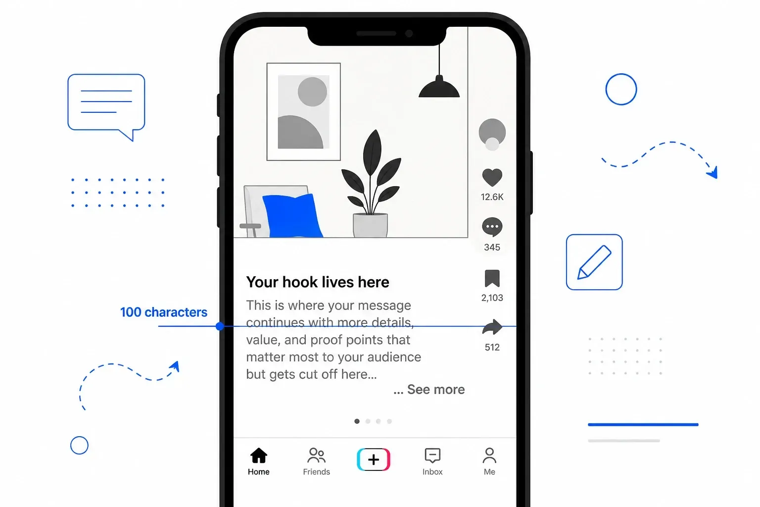
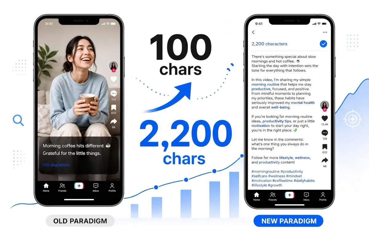
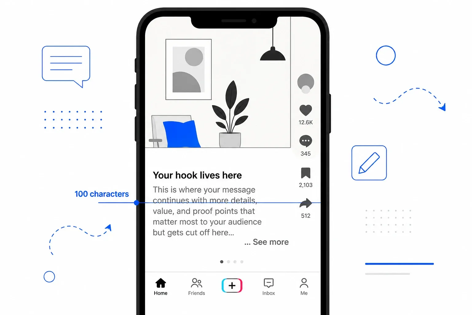
- The video caption (folds at ~100 characters or the first line break)
- The music ticker
- The engagement icon stack on the right (like, comment, bookmark, share)
That’s a predictable stack. On a 1080x1920 full-height vertical video, the bottom unsafe zone - the region covered by this UI - is roughly 384px, or about 20% of the frame. Your safe zone boundary sits at approximately 1536px from the top of the canvas.
When TikTok converts that same video into an in-feed ad, the platform injects a new element: the CTA button. “Shop Now.” “Download.” “Learn More.” “Sign Up.” The button is roughly 48–56dp tall in the native UI stack - which translates to approximately 120–150px on a 1080px-wide 9:16 canvas.
Critically, this button is inserted above the username, not below it. The entire existing UI stack - username, caption, music ticker - shifts upward to accommodate it. Your carefully positioned subtitles, price overlays, and branded text shift with it, sliding up from where they lived in organic view into whatever space is above. But the CTA button itself covers everything it lands on.
The result: the bottom unsafe zone in an in-feed ad expands from ~20% to approximately 25–30% of the screen - or 480–576px from the bottom on a full-height 9:16 frame. That’s a ~100–200px shift of the safe zone boundary compared to organic.
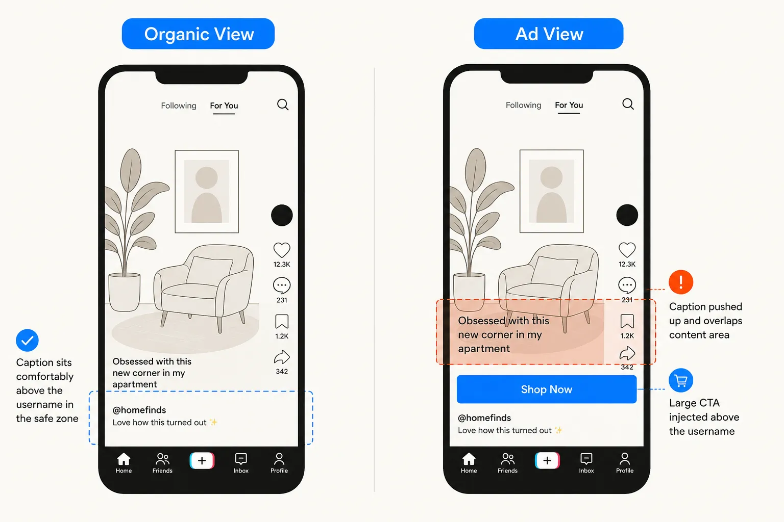
Side-by-side comparison showing the same 9:16 TikTok video in Organic View (clean layout, caption safely positioned) vs Ad View (injected CTA button covers the subtitle), as illustrated for PostTruncate
Side-by-side: the same video in Organic View vs Ad View - the injected CTA button covers whatever was positioned just above the username bar.
Understanding the cascading layout effect
Here’s what makes this layout shift particularly destructive: it’s not just the CTA button that moves. The injection causes a cascade through the entire bottom UI.
On a typical TikTok in-feed ad, the bottom-of-screen UI stack (from bottom edge upward) looks like this:
| UI element | Approximate height | Position from the bottom |
|---|---|---|
| Navigation bar padding | ~20px | 0–20px |
| Music ticker | ~36px | 20–56px |
| Caption text (up to 4 lines, ~20px per line) | ~80px | 56–136px |
| CTA button (injected - ads only) | ~120–150px | 136–286px |
| Username + profile info | ~60px | 286–346px |
Add it up: the top of the username block sits at roughly 346px from the bottom edge - or about 1574px from the top on a 1920px canvas. That’s the region your on-screen text needs to clear.
But here’s where it gets worse: TikTok also reserves the top ~10% (approximately 192px) for the “For You / Following” navigation tabs and status bar. And the right ~15% (approximately 162px) for the profile photo and engagement icon stack. The combination of all three exclusion zones creates a working safe area that’s considerably smaller than the full-screen canvas most video editors are designing to.
On a 1080x1920 canvas, the practical safe working area for an in-feed ad is approximately:
- Horizontal: 108px to 918px (center 750px)
- Vertical: 192px from top to 1440px from top (~1248px of usable height)
That leaves you a canvas of roughly 750x1248px - about 44% of the total frame - where your on-screen text and critical visuals can live safely. Everything outside that rectangle risks being covered, clipped, or obscured by TikTok’s injected UI in ad view.
When you build creative in organic view, you’re working with a larger, more forgiving safe area. When TikTok runs your creative as an ad, you’re suddenly operating with a 44% canvas. The subtitle positioned “just above the username” is now sitting on top of the CTA button.
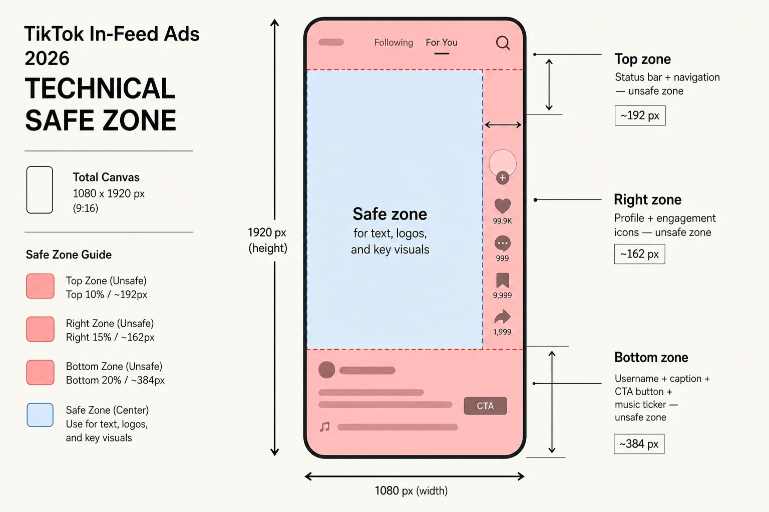
Technical safe zone diagram for TikTok in-feed ads 2026, showing the top 10%, right 15%, and bottom 25–30% unsafe zones with pixel measurements on a 1080x1920 canvas
The 2026 TikTok in-feed ad safe zone breakdown: three distinct unsafe regions that together reduce your usable canvas to roughly 44% of the full frame.
Why organic safe zones are not enough
The conventional TikTok creator wisdom - “keep important text in the centre third and above the bottom 15%” - was designed for organic content. It’s correct for organic content. But it doesn’t account for the additional 120–150px the CTA button adds to the bottom unsafe region in ad view.
Here’s the specific failure case I see most often: a video editor adds a subtitle or price callout at approximately 75–85% vertical position (1440–1632px from the top on a 1920px canvas). In organic view, this sits comfortably above the username bar. In ad view, the injected CTA button covers this exact zone.
The math:
- Organic bottom safe zone: text should clear 384px from the bottom = top boundary at 1536px from the top
- Ad view bottom safe zone: text should clear 480–576px from bottom = top boundary at 1344–1440px from top
That’s a 96–192px window - the gap between “safe in organic” and “safe in ads” - where most placement mistakes happen. It’s narrow enough that a creative can look completely fine in organic preview and still fail badly when it runs as an ad.
This problem compounds when your creative uses text overlays that appear late in the timeline. TikTok’s CTA button is present from the moment the ad starts playing. An animated subtitle that slides in at 2 seconds is covered by the CTA button for its entire visible duration, regardless of where it lands in the timeline.
How the CTA button disrupts caption readability
Beyond the layout shift, the injected CTA button creates a second readability problem: contrast.
TikTok’s ad caption text is rendered in white, non-customizable font. There’s no option to add a text shadow, stroke, or background tint. The platform selects the CTA button’s background colour automatically - typically based on TikTok’s system palette or the dominant colours in your video - so you have no direct control over it either.
This creates a situation where both your ad caption and your CTA button are white-on-color elements sitting in the bottom 30% of the screen, on top of whatever is happening visually in that region of your video. If the video has a light or busy background at the bottom - common in product shots, lifestyle content, or anything with movement - the white caption text becomes nearly illegible.
The organic solution to this problem (adding a semi-transparent dark scrim behind the text, adjusting text colour, using a contrasting background in that video region) doesn’t exist for ad captions. You’re stuck with white text on whatever the video shows at that point.
What you can control is the video background itself in that region. If you know your ad caption will appear in a certain frame of the video, you can plan the shot so the background behind the caption zone has enough contrast to support white text. This requires knowing, before you shoot or export, exactly where the caption will land.

Close-up UI illustration showing white ad caption text rendered illegibly against a busy, light-colored video background in the bottom 30% of a TikTok in-feed ad
White caption text on an unpredictable video background: the contrast failure that becomes invisible until the ad is live.
The Spark Ads exception - and why it’s not a free pass
Before I get to the solution, there’s a common workaround worth addressing: Spark Ads.
Spark Ads let you promote an existing organic post rather than creating a native ad from scratch. Because the video was originally published organically, it inherits the organic TikTok interface - the caption, hashtags, and layout render exactly as they did in organic view. The CTA button still appears, but it layers on top of the organic layout rather than restructuring it.
This sounds like it solves the safe zone problem. It partially does - for caption text. But it doesn’t solve the on-screen text problem.
The CTA button still injects into the bottom of the screen even on Spark Ads. Any text, subtitle, or graphic you baked into the video file at the bottom 20–30% of the frame will still be covered. The difference is that your caption text (which in organic can be up to 4,000 characters) may be more visible, since the Spark Ad layout retains the organic caption behaviour rather than enforcing the 100-character native ad cap.
If your organic video has important on-screen text baked in near the bottom, Spark Ads will still cover it. You need to check both views regardless.
The step-by-step QA workflow before you spend
Here is the exact pre-flight process I run on every TikTok creative before it goes into Ads Manager:
Step 1 - Export a still frame from your video timeline. Take a screenshot or export a representative frame from the point in the video where your most important on-screen text, subtitle, or graphic appears. This becomes your reference image for layout checking.
Step 2 - Load it into the ad preview tool. Use the TikTok ad layout preview on PostTruncate - upload the still frame as your preview canvas, or just type your ad caption into the description field if you’re only checking text placement.
Step 3 - Toggle between Organic View and Ad View. This is the key step. Organic View shows the standard TikTok layout with the username-and-caption block at the bottom. Ad View injects the CTA button, shifting the entire bottom UI upward. You’ll see immediately whether any of your on-screen elements fall into the newly covered zone.
Step 4 - Check the three unsafe zones. Use the safe zone overlay to confirm:
- Nothing critical is in the top 10% (~192px from top)
- Nothing critical is in the right 15% (~162px from right)
- Nothing critical is in the bottom 25–30% (~480–576px from the bottom, using the Ad View boundary, not organic)
Step 5 - Adjust, re-export, re-check. If anything critical is in the unsafe zones, go back to your editing timeline, shift the element up or toward the centre, re-export the frame, and re-check. Repeat until the Ad View is clean.
Step 6 - Write your description last. Once the visual safe zones are confirmed, write your ad caption knowing that your most important message needs to fit in the first 50–70 characters (see the 100-character trap in TikTok ad text for the full breakdown on description truncation). The visual layout check and the text check are two separate workflows - run both before you spend.
This whole process takes under five minutes. The cost of skipping it is potentially high: a campaign where the core value proposition is visually buried, running at full spend, while you wonder why conversion rates are flat.
Why is this problem getting worse over time
TikTok’s CTA button behaviour has become more prominent in the platform’s UI over the past few years, not less. In earlier versions of TikTok Ads, the CTA was a smaller element. As TikTok has expanded direct response capabilities - shopping integrations, app install campaigns, lead generation - the CTA button has grown larger and more visually dominant.
In 2026, TikTok has also increased the range of available CTA labels (now including “Shop on TikTok,” “Get Quote,” “Book Now,” “Contact Us,” and others), and the button system automatically selects background colours based on your video content. This means the button can be quite visually prominent - a bright contrasting colour against your creative - rather than a subtle affordance.
The trend is clear: TikTok is optimising its ad UI for conversion, and that means the CTA button is going to keep taking up more visual real estate, not less. The gap between organic safe zones and ad safe zones is likely to widen in future UI iterations, not shrink.
The practical implication for media buyers and video editors: build ad-native safe zones into your creative from the start. Don’t design for organic and adapt for ads. Design for the ad-view layout first - the more restrictive constraint - and confirm the organic view looks acceptable as a secondary check.
This is the opposite of how most creative teams currently work, because organic previews are what TikTok shows you by default and what most editing tools support. But the organic view is not what your paid audience sees.
What the conversion rate impact actually looks like
I want to be specific about why this matters to the bottom line, not just to visual quality.
TikTok in-feed ads are direct-response instruments. The CTA button’s entire purpose is to drive a click - to an app store, a product page, a lead form. The description text and any on-screen text are the persuasion layer that motivates the click. When your persuasion layer is buried under the button, you’re spending money on impressions that can’t convert at the rate they should.
There’s no published TikTok data on the conversion rate differential between ads with covered on-screen text versus clean layouts. But the logic is straightforward: if a viewer can’t read your product’s name, the price, the offer, or the unique selling point because the “Shop Now” button is sitting on top of it, they have less reason to tap.
For direct response campaigns on TikTok - where CTR and conversion rate are the primary efficiency metrics - a layout error in the creative is a tax on every impression. The campaign delivers the impressions; the broken layout stops them from converting.
The fix costs nothing. The QA workflow takes five minutes. The alternative is running a campaign at full budget with a fundamental visual error baked into the creative from day one.
Try PostTruncate
PostTruncate is the tool I built after making this mistake enough times to want a faster way to catch it. The TikTok ad preview lets you upload your creative thumbnail, toggle between Organic View and Ad View, and see the injected CTA button in real position - with safe zone overlays for all three unsafe regions. The description field simulates the ad caption with the truncation fold marked, and the character counter tracks your remaining safe zone budget in real time.
Everything runs in your browser. Nothing is uploaded or stored. It’s free, no account needed, and the check takes about 30 seconds per creative.
If you’re running a TikTok campaign this week with on-screen text in the lower third of your video, run it through Ad View before it goes live. The probability that at least one element is in the newly-covered zone is higher than most media buyers expect.
PostTruncate TikTok ad preview tool showing the Organic vs Ad View toggle with safe zone overlays on a 9:16 video canvas
PostTruncate’s TikTok ad preview with safe zone overlays - check your creative in both Organic and Ad View before spending.
Run your TikTok creative through the PostTruncate Ad View simulator before your next campaign goes live - it takes 30 seconds and costs nothing.
FAQs
What is the difference between the TikTok in-feed ad layout and organic post layout?
An organic TikTok post places the username, caption, and engagement icons at the very bottom of the screen. A TikTok in-feed ad injects a large colored CTA button (such as 'Shop Now' or 'Download') directly above the username, pushing the entire bottom UI element stack upward. This adds roughly 56–72dp of additional UI at the bottom, turning what was a 15–20% unsafe zone in organic into a 25–30% unsafe zone in ad view. Any on-screen text or graphic you placed in that formerly safe band will be covered. Use the TikTok ad preview toggle on PostTruncate to simulate both layouts before exporting your creative.
TikTok injects the CTA button above the username bar, which cascades the entire bottom overlay upward. On a 1080x1920 video, the injected button adds approximately 120–150px to the bottom unsafe zone. On a 9:16 frame, that means moving your bottom safe zone boundary from roughly 1536px (top of the original bottom 20%) up to approximately 1440–1470px. Any subtitle, price callout, or logo placed between those two lines - safe in organic - will be partially or fully obscured when the ad runs.
How many pixels does the TikTok CTA button take up at the bottom of the screen?
TikTok's injected CTA button is approximately 48–56dp tall in the native UI stack. On a 1080x1920 frame, that translates to roughly 120–144 pixels of additional UI at the bottom of your video beyond the organic username-and-caption block. Combined with the caption text (up to 4 lines, white non-customizable font), music ticker, and profile icon, the total bottom unsafe zone in an in-feed ad is approximately 480–576px - or 25–30% of a full-height 9:16 canvas.
What is the TikTok ad safe zone for video text and graphics in 2026?
For TikTok in-feed ads in 2026, keep all on-screen text, logos, and critical visuals within the central 60–70% of the 9:16 frame: starting roughly 192px from the top (10%) and ending no lower than approximately 1440px from the top - leaving a 480px+ buffer at the bottom. Also keep content at least 162px in from the right edge (15%) to avoid the engagement icon stack. The safest working area is roughly the centre 70% of the vertical frame, between 10% from the top and 25% from the bottom. You can verify exact placement with the TikTok ad layout simulator on PostTruncate.
Use the TikTok ad preview tool on PostTruncate.com. Upload your video thumbnail, toggle between Organic View and Ad View, and see exactly how the injected CTA button shifts the bottom UI and what it covers. The tool shows safe zone overlays for the top bar, right rail, and bottom UI block in both modes. Nothing is uploaded or stored - the preview runs entirely in your browser, free, no account required.

Join the discussion
Comments are reviewed before they appear, so yours won’t show up right away.